Recently, I have been falling in love with and haunted by colors. I believe color choice in figures is an under appreciated but critical for communication of data and ideas. Colors should be good looking, accessible (including printing in greyscale well), and reflect the underlying data. In trying to understand color better, I have fallen into a deep rabbit hole of color theory. I won’t pretend to be an expert here, but I have learned things along the way that are hopefully interesting if not helpful for how scientists can choose better colors.
It isn’t as simple as primary colors.
Having no serious art training, I don’t think my brain ever internalized what the primary colors are. If you would have asked me, I probably would say red, green, and blue (RGB) based off my love of technology and the RGB pixels that power displays. These three colors when added together can produce many of the colors the human eye can see! But still not that much—think around 30–50% depending on the exact technology used.
If I did have art training, I’d probably say that red, yellow, and blue (RYB) are the primary colors. These are called the “subtractive” colors because they subtract from a white background. Adding the three primary colors together creates black. Ask a printer and they’ll have a similar but slightly different answer—cyan, magenta, yellow, and possibly black (CMYK).
Regardless of what the primary colors are, in principle these primary colors can combine to create a whole color wheel. But color wheels produced from different primary colors are distinctly different. For example, in RGB space, red and green are “buddy” colors; they can be combined to produce yellow as a new color. In RYB color space, however, green is created through the mixture of yellow and blue and, as such, is directly opposite to red on the color wheel. In other words, this suggests that red and green can not be mixed to produce a new color. This also sort of follows intuitively—it is easy to think about a color that is a reddish-yellow, but I cannot picture in my head what a reddish-green would be other than a muddy blah.
This thinking motivates other, more niche, sets of primary colors. Opponent process (a color theory) and CIELAB (a color space like RGB), as two examples, describe four “primary” colors, each setup as an opposite pair: red and green, and blue and yellow.1 This allows for any color to be described through a combination of lightness, and of hues in the red-green and yellow-blue axes.
Defining color is just math.
All of this boils down to a key point: working with colors requires creating a color space and a way to access it through mathematics. That’s really all that RGB, CMYK, or CIELAB models are. When choosing a color, say in Adobe Illustrator, this is most commonly done through setting values for one of four different systems:
- RGB: values of red, green, and blue, are provided as described above. This system is “additive” and meant to generate its own light (like a display). Mathematically, each value traditionally ranges between 0 and 255 (capturing 8 bits of data). Setting these three values affects not only the hue produced, but also the saturation (how colorful it is), and its lightness.
- Hexadecimal: this is equivalent to RGB, but each value ranges from 00 to FF (instead of 0 to 255). The red, green, and blue channels are capture by the first, middle, and last two digit pair. This is most useful (in my opinion) for copying and pasting, because the whole color is defined in one string, like #E34234 for the color vermilion.
- CMYK: Values of cyan, magenta, yellow, and black are provided as described above. This system is “subtractive” because it assumes the inks (e.g., from a printer) will be placed on a white background, which then subtract from that background. Mathematically, the four values are traditionally set between 0 and 100. Like RGB and Hexadecimal, these values control the hue produced, its saturation, and its brightness.
- HSB: Values of hue, saturation, and brightness. Rather than setting the amount of each primary color, this method tries to allow for more direct selection of individual parameters. I say “tries” because, even here, there are issues with exactly how bright a color is. More on that later! Anyway, mathematically, this system looks like either a cylinder or a cone—so it is accessed through polar coordinates. Hue is captured by an angle of the cylinder/cone between 0°–360°. Saturation and brightness make up the radius and height, respectively, each traditionally set between 0–100. This method is the same as HSV (hue, saturation, and value) but different from HSL (hue, saturation, and lightness).
The trouble with all of these systems is that human vision does not fall within such a neatly organized box. Each system takes a shortcut for ease of use (or computation) that either simplifies color theory or, worse, misleads color choice decisions. Worst of all, these simplifications aren’t well “advertised”.
For example, let’s take three basic colors: red, green, and blue primaries from RGB space. These colors are defined in the following way for the four color systems above (from Adobe Illustrator):
| RGB | Hex | CMYK | HSB | |
| Red | (255, 0, 0) | #FF0000 | (0, 100, 100, 0) | (0°, 100, 100) |
| Green | (0, 255, 0) | #00FF00 | (100, 0, 100, 0) | (120°, 100, 100) |
| Blue | (0, 0, 255) | #0000FF | (100, 100, 0, 0) | 240°, 100, 100) |
The values in the table above—and especially HSB—imply all three colors are the same brightness. But this doesn’t actually turn out to be the case. We can take the three colors, convert them into greyscale using a tool like Photoshop and see three very different levels of grey.
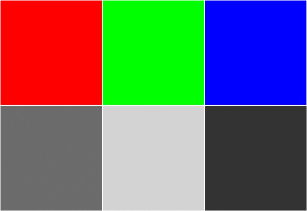
It turns out that humans perceive different colors at different effective brightnesses. In other words, green will appear brighter than red, which will appear brighter than blue (assuming all colors are saturated). The common mathematical models for color don’t make this distinction, however. Their job is to give us that nice box to choose colors from, where we don’t have to worry about entering a set of color values that are “out of bounds” to reality. The price we pay is a lack of control—for example, it becomes very difficult to pick visually distinct saturated colors and guarantee that they will remain distinct if printed on a greyscale printer. You as the author or artist have to know that brightness isn’t a uniform quantity.
A color’s brightness and saturation are inherently linked!
The simplifications from RGB, etc. color spaces start feeling somewhat justified when you see more realistic depictions of the colors humans can see. It is fundamentally three dimensional, making it hard to visualize on a screen, and not at all uniform in shape. Certain regions are skinny, where others jut out reaching into the void.
But one point stands out to me from these more complex color models: how bright a color can be depends on how colorful that color is!
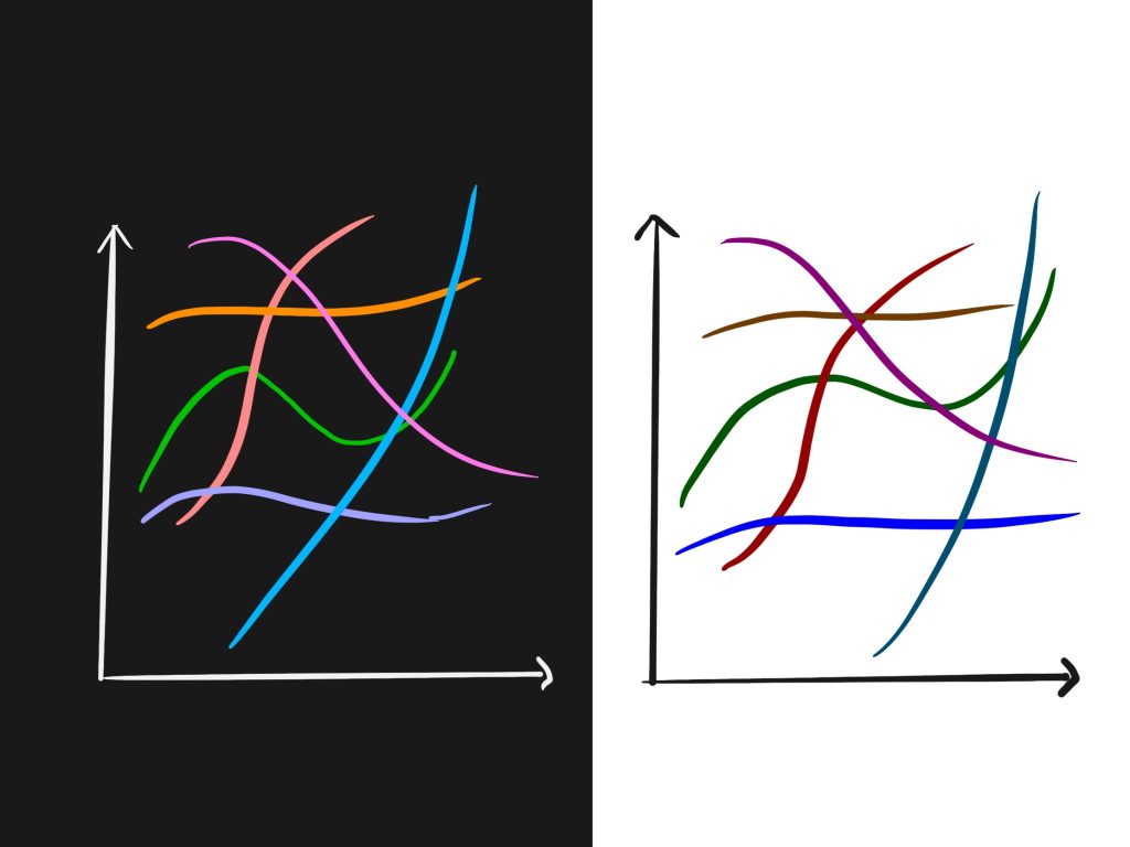
A very blue-blue can only be obtained if it is also fairly dark. Conversely, a very yellow-yellow has to be bright. This is why it is challenging to read yellow text on a white background, or blue text on black. It’s possible to map these peak colorfulness points out: blue hues are most blue through a decent range of absolute lightness, between 0% and ~39%, but all of these are quite dark; purple has a narrow window of peak color, at about 37.5% lightness; red hues reach peak redness between 40–52% lightness; orange near 68%; greens between 75–85%; and yellows top off near a whopping 97%! My favorite way of visualizing this is through the online color picker tool HSLuv.org, which implements a CIELUV color space that has been transformed to cylindrical coordinates similar to HSL space. Such a transformation requires a sacrifice—the saturation value becomes normalized and not absolutely comparable between hues, but lightness is retained absolute. (And unlike HSB, HSLuv is very transparent about this simplifying assumption.) I fully recommend you try out this tool! Peg the saturation at 100% and drag the lightness slider around to see how different hues appear and disappear.
One neat thing this showed me was how an absolute lightness of ~70% gives the most choices for saturated colors. This gives colors with pastel-like brightness but boosting saturation gives colors that pop and distinguish themselves from one another. Reds are notably missing at this brightness, but greens, oranges, salmon, purples, and light blues are well represented. In comparison, setting an absolute lightness of 30% really only gives saturated blue and red, with a sort of low-brightness purple verging on pink in between. This, and my love of yellow-gold hues, has really pushed me toward embracing dark themes lately to use more of the colors I find pleasurable and maintain adequate contrast to pass accessibility standards.
There is so much more to talk about—like how RGB and CMYK capture slightly different areas of what the human eye can see (called their gamut), or how many color systems are out there. But these are—perhaps—stories for another day.
- These colors are slightly simplified, but get the point across well enough. For example, opponent process suggests the opposite pairs are carmine-red, cobalt-green, cobalt-blue, and yellow. Even still, everybody’s eyes are unique, and different individuals identify slightly different exact opposite hues. ↩︎
Leave a Reply