I love making figures to describe my data or science. This is less of a single project and more of an ongoing hobby, an expression of art, and a fascination. Here are some of my favorites (updated when new figures are created).
animated refractory alloy elements showing random element selection
(Created with HTML. Periodic Table produced in Adobe Illustrator; animation produced with Claude.)
Refractory alloys are challenging to design for, in part, because the design space itself is so large. I consider the elements above to be relevant to this space. The animation selects 3–5 elements from the above randomly and highlights them. I find this mesmerizing to watch and try to catch any element set being repeated. At a 1 at% grid, fully capturing all alloys in this element set would require ~119 billion billion alloys (1.19×10²⁰)! For context, this is equivalent to the number of stars in 300 million Milky Ways.
color-shaded portion of the garnet crystal structure, focused on a dodecahedral site
(Created in Procreate on iPad and Adobe Illustrator.)
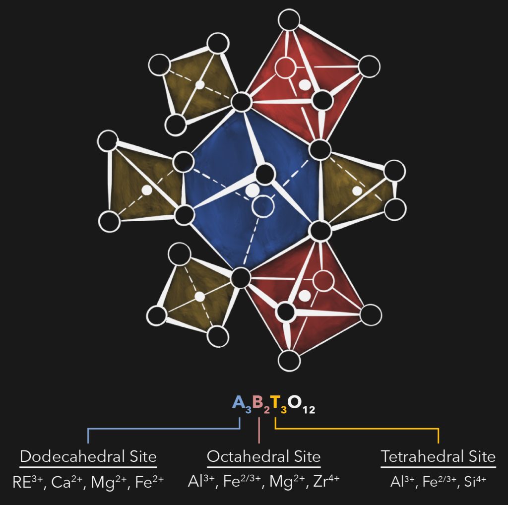
This is one of my absolute favorites. The crystal structure and chemistry of garnets are super fascinating and remarkably complex. To share my research on them, I needed some way to teach the essentials very quickly. The hand-drawn portion of the crystal structure shows how the different polyhedra are connected, without overwhelming the eye by showing all polyhedra. The shading brings a pop of color and also functionality tied to the crystal chemistry below. How different elements are distributed between the sites is shown at the very bottom.
This figure was a part of my 2024 presentation at ICACC. The schematic of the crystal structure is heavily inspired by the beautiful figure from Novak and Gibbs (1971) The Crystal Chemistry of Silicate Garnets.
timeline of select large language model releases
(Created in Adobe Illustrator.)
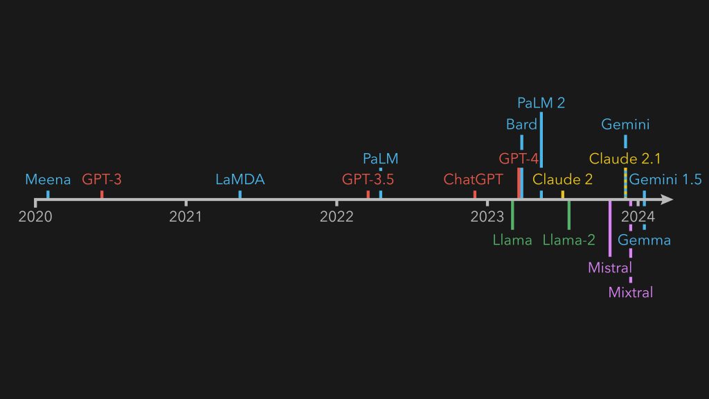
Entries are colored by the company that trained/produced the model. Models with open weights or that can be self hosted are beneath the timeline; closed models are above the timeline. I love how well this shows the blowup in development over the past few years.
This figure was included in my presentation on using how large language models can be used to help the research process. A pdf of the presentation is below!
schematic of flyer plate impact
(Created in Adobe Illustrator.)
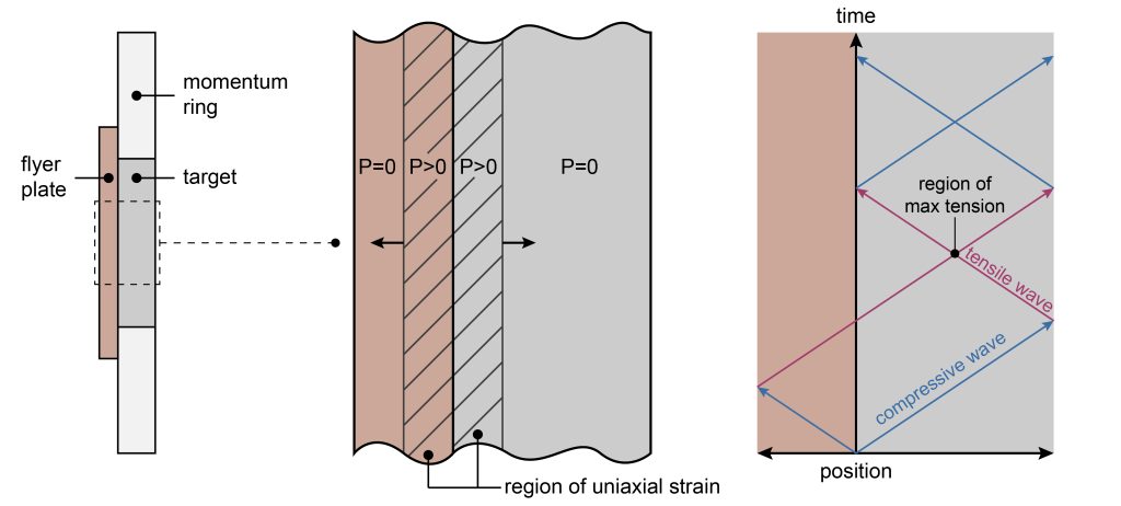
I’m quite proud of this figure because it is made to scale and it depicts a complex mode of material failure as easily as I could. The left shows the time of impact between a flyer plate (copper color) and a target held in a momentum ring (in shades of grey), which are used to study high strain rate dynamics. The middle frame zooms into the center region, where pressure waves propagate and create a region of uniaxial strain. The right depicts a x-t (position vs. time) diagram, tracing the pressure wave pathways. Both waves begin as compressive, but transform into tensile waves upon reflection at free surfaces. These tension waves then constructively interfere to create a region of max tension, which can cause the target to rip in half through a process called “spall”.